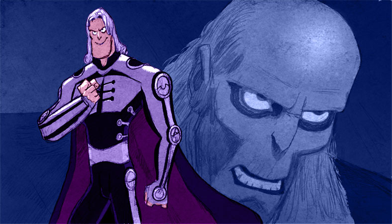
Here is my take on “the baddie” in a project I worked on recently. The job died almost as soon as I delivered the artwork… which was a bunch of character studies; both B/W sketches and a few colour pics like this one. 90% of such jobs tend to die on the operating table.
Too bad, this looks like it would have been a cool project.
What are you doing to get the nice texture into your image. Do you have certain textures and you set them on Overlay? Just curious as I’m trying to incorporate more texture into my own stuff.
Nice work sir.
John> I have been collecting textures, usually just sampled from analog pictures that I have drawn and painted, and sometimes I lay them in over colour stuff, especially if the drawing is loose, as is the case with this one.
Sometimes it is a MULTIPLY layer but other times it is COLOUR DODGE, or COLOUR BURN. It depends on the texture and the image… and you have to play around with the percentage as well.
Wow, love the costume. Great stuff.
It’s a shame the project died, this guy is cool. Hope you can share more from the project and give it a little bit of life on your blog!
Thanks Jamie!
Hey Jamie,
Thanks for the tips. I haven’t had much success with colour dodge or colour burn. I’ll have to play with them a little more.
I love it! You have this amazing mix of cartoony and crrraazy awesome.